Monday, 21 November 2011
Wednesday, 2 November 2011
PANTONE COLOURS
Here is a list of my favourite Pantone colours from Red, Blue, Violet, Orange, Green, Yellow colour ranges.
COLOUR THEORY AND INTRODUCTION TO PANTONE
On Tuesday we began to study colour theory. The week before we collected 5x Red, Yellow, Blue, Green, Orange, Violet coloured objects. On Tuesday we laid all of these out in a massive colour wheel that stretched around studio 4. This was accompanied my a workshop which helped us understand colour theory especially regarding the use of Tone, Hue and Saturation and colours relationship to physics and human biology.

We split up into small groups and were assigned a colour to work with. I was assigned to red and we selected 10 items from the red area of the spectrum based on variations in Saturation, Shade and Tint. We then used a series of Pantone swatches to find the pantone value of each items colour. Here are some examples:
 |
| Pantone 208m |
 |
| Pantone 201c |
 |
| Pantone 186c |
 |
| Pantone 187c |
 |
| Pantone 1788c |
Sunday, 23 October 2011
GROUP BLOG WORK// Leeds Music Venues
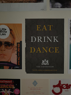
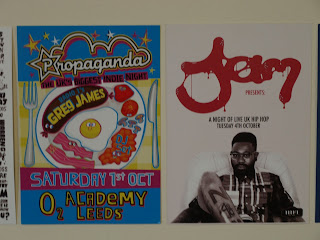
As a student city there are many, many venues for all sorts of music
tastes. In the first few weeks of Uni students a re bombarded non-stop
with leaflets. Clubs all trying to make the most impressive designed
poster to attract the masses, or sometimes (no-bones) a niche crowd.
When there is so much information about these events going out designers
have to really step up and create something that really, really stands
out...
GROUP BLOG WORK// Alcohol Packaging
Here are some photos I took of the design on the front of bottles and
crates of alcohol. Designers have to think about the target audience,
what sort of people will drink what sort of beverage, what the audience
expects the packaging to look like also for example.
Crates of San Miguel are coloured a deep golden to reflect the perceived quality of the beer and the warmth of its taste. A Blackletter type and old trade ship suggests years of experience and hits towards times of the Spanish empire. A fake condensed water is printed on the top to represent a cold beer on a hot day.
Erdinger is a German beer so a Germanic/ Roman font is used. Erdinger is suppose to be an above average beer so the label design is busy with text and image of a 'turn of the century' 1900's feel. It is also a wheat beer so this is symbolised many times on the bottle.
Strongbow and Fosters are low end beverages. However they are still both from major breweries so they get good designs. The fosters 'F' brands the beer almost like a sportswear brand, which is rare for alcohol. The cans are instantly recognisable as a result. Once again fosters use this warm golden yellow to reflect the colour of a pint on a sunny day.
Russian Standard and Smirnoff, both try to conjure images of their Russian origins. Pre-revolution Russia to be precise, with crowns, domes, gold foiling, etc. Russian Standard even prints its name in Russian to force the point of quality and originality.
When people look for cheap items they are drawn to anti-design. Despite the ability of Tescos to hire designers to make a beautiful label they slap on this. Because people will be looking for the label, not the price!
Friday, 21 October 2011
GROUP BLOG WORK// Awareness of ethical issues
On of our five topics to research was awareness of ethical issues. I have been doing some research on the massive amount of poster design that was done in a response to the start of the war in Iraq. These posters were mainly designed quickly and by amateurs for the worldwide protests hat were occurring at the time. Most focus on the evilness of stupidity of George Bush and Tony Blair or the massive human cost of war. The posters all aim at raising awareness of the war, providing an opposite story from the new corporations perspective at the time.
Tuesday, 18 October 2011
WHAT IS GRAPHIC DESIGN// Different Scale (5/5)
Here are some examples of Graphic Design at different scales from small to large;
-Book Cover
-Microchip
-Book Cover
-Posters
-Train/ Blimp
-Field
Subscribe to:
Posts (Atom)


