What skills do you think you have developed through this module and how effectively do you think you have applied them?
During this module I have developed an greater understanding of the practical and professional concerns of individual creative practices. I have begun to think about investigating the personal, professional, innovative
and entrepreneurial aspects of the creative industries and
communities of practice. And have started to establish an increasingly independent understanding of the practical
and contextual location of my individual creative ambitions by getting out there and researching a number of institutions. I have also developed a higher understanding of the communication skills needed to approach said institutions in a more confident way.
What approaches to methods of design production have you developed and how have they informed your design development process?
I have been applying what I have learnt in the other modules to my own personal branding throughout this module, I think that most of the 'design process' skills I have acquired have been from these other modules. In this module I have developed a greater knowledge in other aspects of my design practice, like how the industry works had how to make an entry into this. However I have produced a solid set of business cards and a great website for this brief that has improved my skills in both of these areas. This has in turn given my more confidence to approach studios which my own applied branding in place and a website.
What strengths can you identify in your work and how have/will you capitalise on these?
My strengths have been in the design department for this module, I have produced some personal branding that I am happy with and coded a successful website that runs well. I will obviously be able to capitalise on these by using the cards and site to approach designers and studios out in the real world for the first time since foundation. I have also found that my presentations skills are still good, I did the presentation earlier today and found that it was as easy as I thought it would be. This is a real strength I can capitalise on, being able to present confidently to a group of people will be a big advantage when I have to start pitching to clients and studios later in life. However how this will translate into pitching to strangers I have yet to find out, I am very comfortable in the year group so I want to have a go at something out of my comfort zone.
What Weaknesses can you Identify in your work?
My weaknesses have been in putting this module to the back of my mind throughout the whole year. This has left me with a lesser understanding of my personal and professional practice than I could have achieved, for which I am greatly ashamed about. I think that with the creation of the website and that I have started to contact studios shows that I have at least started what the aim of this module was to achieve but I still thing I could be further along the road if I had but more focus into this module.
Identify five things that you will do differently next time and what do you expect to gain from doing these?
- Understand that the PPP module is not just tagged onto the rest of the course and that I should take it much more seriously in the future. I only really saw this towards the end of this year when I started looking at studios to contact and realised the importance of listening and working throughout the rest of this module.This will help me be more confident in my knowledge going forward into the third year.
- Blog the studio workshops. I was at all the studio workshops, wrote notes throughout all of them and learnt a great deal during them, however I never blogged any of it. This is a huge waste of time as I could have demonstrated that I understood the workshops here, but totally neglected this. This point it closely linked to point 1, that I did not take the module seriously till it was far too late.
- Have a more driven approach to contacting studios, I can continue to visit studios through my third year and beyond, and I still have loads of time to get involved over summer. Now that I have confidence that I have work to show these studios I feel like I can go ahead and get in touch with something to back up my claim that I do graphics.
- In the future and In the third year, where we will be doing much more self directed work, I will want to do a lot more for my personal website, to really get the work on there up to scratch in a big way and have more pieces that really stand out. This should provide the site with more punch when I send it off to studios to have a look at it.

Friday, 31 May 2013
Thursday, 30 May 2013
Creative CV

LIFE'S A PITCH// Links to Logo Work on DP Blog
Not long to go and I've realised all my life's a pitch work is on the work blog: Here are some Links to the Logo Development work:
http://l-rossiter1114-dp.blogspot.co.uk/2012/12/lifes-pitch-overout-e-flyer.html
http://l-rossiter1114-dp.blogspot.co.uk/2012/12/lifes-pitch-overout-logo-design-2.html
http://l-rossiter1114-dp.blogspot.co.uk/2012/11/lifes-pitch-overout-logo-design.html
On another note I wasn't able to attend the Pitch presentation, so this was not documented here.
Tuesday, 28 May 2013
Personal Website
lukerossiter.co.uk
My website is now up a running at the address above. This is great news because it means I can start sending it off to studios. I designed the things so that the logo and information stays fixed on the page. When the user scrolls the content moves and this all sits in dwusers easy slider, a great program that edits itself into the html with some jquery code. This means the whole site can be put on one page in a manageable way. I'm really pleased with the way this site has turned out, its simple, the information is all there on the main page and the contact details and branding are all at the front. Hopefully when creatives view the page they will be able to ingest a large amount of the content without getting bogged down because of these design decisions.


My website is now up a running at the address above. This is great news because it means I can start sending it off to studios. I designed the things so that the logo and information stays fixed on the page. When the user scrolls the content moves and this all sits in dwusers easy slider, a great program that edits itself into the html with some jquery code. This means the whole site can be put on one page in a manageable way. I'm really pleased with the way this site has turned out, its simple, the information is all there on the main page and the contact details and branding are all at the front. Hopefully when creatives view the page they will be able to ingest a large amount of the content without getting bogged down because of these design decisions.


Wednesday, 15 May 2013
STUDY TASK 8// What is a Creative CV?
Effective:
South Block Studio 107
60 Osbourne Street Glasgow G1 5QH
Telephone +44 (0)141 271 4721
studio@effektivedesign.co.uk
Espen Hansen:
mail@esphansen.com
Vollenlia 110B 1390 Vollen, Asker, Akershus, Norway
Passport:
+44 (0) 7850 981 901
Studio 5, Duke Studios,
1st Floor,
Munro House,
Duke Street ,
Leeds, LS9 8AG
Two Times Elliott:
Edenspiekermann:
Uniform
OAT:
248 Beacon Street
Somerville, MA 02143
617 800 2636
Rory@oatcreative.com
Jen@oatcreative.com
Studio Output:
Studio Output / London
Unit 4, The Piano Works
117 Farringdon Road
London EC1R 3BX
+44(0)20 7239 9270
london@studio-output.com
Why Not Associates:
why not associates limited
22c shepherdess walk
London N1 7LB
united kingdom
t +44 (0)20 7253 2244
f +44 (0)20 7253 2299
info@whynotassociates.com
Futurebrand:
2 Waterhouse Square
140, Holborn,
London EC1N 2AE
United Kingdom
P. 44 207 067 0010
South Block Studio 107
60 Osbourne Street Glasgow G1 5QH
Telephone +44 (0)141 271 4721
studio@effektivedesign.co.uk
Espen Hansen:
mail@esphansen.com
Vollenlia 110B 1390 Vollen, Asker, Akershus, Norway
Passport:
+44 (0) 7850 981 901
Studio 5, Duke Studios,
1st Floor,
Munro House,
Duke Street ,
Leeds, LS9 8AG
Two Times Elliott:
Studio 112
Great Western Studios
65 Alfred Road
London W2 5EU
Great Western Studios
65 Alfred Road
London W2 5EU
Info@2xElliott.co.uk
+44 (0) 20 3214 3133
+44 (0) 20 3214 3133
Edenspiekermann:
edenspiekermann_
Barentszplein 7 II
1013 NJ Amsterdam
The Netherlands
Tel.: +31 20 550 6300
Fax: +31 20 550 6399
info@nl.edenspiekermann.com
Uniform
Third Floor,
Link 19,
9-19 Bold Street,
Liverpool,
L1 4DN
+44 151 709 9055
Link 19,
9-19 Bold Street,
Liverpool,
L1 4DN
+44 151 709 9055
OAT:
248 Beacon Street
Somerville, MA 02143
617 800 2636
Rory@oatcreative.com
Jen@oatcreative.com
Studio Output:
Unit 4, The Piano Works
117 Farringdon Road
London EC1R 3BX
+44(0)20 7239 9270
london@studio-output.com
Why Not Associates:
why not associates limited
22c shepherdess walk
London N1 7LB
united kingdom
t +44 (0)20 7253 2244
f +44 (0)20 7253 2299
info@whynotassociates.com
Futurebrand:
2 Waterhouse Square
140, Holborn,
London EC1N 2AE
United Kingdom
P. 44 207 067 0010
Saturday, 4 May 2013
STUDY TASK 7// Samples Of Work
Effektive:


Espen Hansen:
"I believe that the key to optimize a marketing strategy is to use visual communication to reach the right target audience."
Strength: Bold focus on target audience. Throws out trendy design for hitting target.
Weakness: Not a modern looking design that other designers may find a bit out of date.
Opportunities:Clear that the branding is for tough sportswear, other likeminded clothes manufaturies may get in contact. Possibility that disregarding trends will lead to timeless design.
Threats: That this style will look ever-more dated in a few years time and the branding will need to be updated.


Passport:
As the name Passport suggests, travel is a large source of inspiration for us. Where you are born; where you grow up; where you study; where you work; where you visit affects everything from choice of colour to application of type – and we like that. Our branded stationery needed to reflect all of these interests. We wanted it to feel classic but contemporary, formal yet approachable, whilst taking care to present a close attention to detail that we pride our work on. The printed collateral includes personal photography collected from our travels to add a strong, individual element to the identity.
Strengths: Bold and up to date design style with a solid use of colour and attention to detail. Appreciation of simple design means that the aesthetic is unlikely to look bad in the future.
Weakness: Everyone is doing this sort of photography now. Branding only applied to small everyday items.
Opportunities: Strong personal visual identity reflects well on aspirations and for clients.
Threats: Being a small studio will require a lot of work to get noticed.


Two Times Elliott:
"A refresh of our corporate stationery, identity and website. The idea was to create an understated, simple and tactile set using a combination of GFSmith papers, foils and embossed details."
Strengths: Again a simple idea with bold design. Solid use of colour and concept.
Weaknesses: Probably not the aim but a lot of clients may not see the beauty in the style. Will probably look bad in a decade, so they will probably refresh their visual identity again.
Opportunities: Croporate stationary reflects well on the practice as a whole.
Threats: Again they will probably have to refresh their design styles again after a while.


Edenspiekermann:
"TCHO – that's highest quality fair trade chocolate manufactured using the most modern technology in a gigantic warehouse in the San Francisco docks. The challenge for Edenspiekermann is to give this gourmet's experience a face. The possibilities are endless, as TCHO is still in the starting blocks."
Strengths: Strong link to brand identity and a real sense that the clients needs were met. Expensive and finished well.
Weaknesses: Some of the patterns look like a kaleidoscope. Perhaps also the foiling is over the top in my opinion.
Opportunities: Interesting to see a cutting edge design studio take on something old and established like chocolate.
Threats: Applying this sort of design to an item with an established visual identity may backfire. I also thing that the whole thing could took a bit 70's what with all the browns and orange in a few years time.


Uniform:
"Abandon Normal Devices (AND) is a major regional festival of new cinema and digital culture already in its second year and is driven by an exciting new partnership between three of the UK’s leading art and culture institutions. Cornerhouse in Manchester, FACT (Foundation for Art and Creative Technology) in Liverpool and Folly in Lancaster have joined forces to collaborate on the exciting task of creating a new festival from scratch."
Strengths: Use of visual puns and satire are a strong way to convey a message in an intelligent way.
Weaknesses:
Opportunities: Being part of a startup festival is probably a great experience, and provides the designers will an interesting creative challenge.
Threats: Looks like a protest logo.


OAT:
"With a "naughty child" and a face full of noodles, we knew we would have some fun helping this British-based restaurant group transition to the us market, by expanding their brand through illustration and design for onsite collateral, apparel and advertising."
Strengths: Plays to the consumer and market well. Strong use of application of design.
Weaknesses: Some illustrations and overcomplicated colour pallet are a weak choice in my opinion.
Opportunities: To help a British brand work internationally. Will bring fame and monies.
Threats: That the branding does not go far enough to capture the imagination.

Studio Output:
The BBC Concert Orchestra hosts an eclectic array of concerts and produces bespoke promotional material relevant to each event. 2012 saw two concerts exploring extreme emotional states, under the names 'Exstatica' and 'H7steria'. We created a unique look & feel to promote each event, reflecting both the themes addressed in the music and the emotions felt by the audience.
Strengths: High level of visual imagery and interesting use of bold colour and layout.
Weakness: None.
Opportunities: To be involved in an unusual form of music and contribute to a cultural experience.
Threats: None


Why Not Associates:
"Corporate identity for xtreme information’s media resource service showcasing commercials and promos."
Strengths: Simple identity will a great example of application that really shows off its diversity. Easily reproducible.
Weakness: None.
Opportunities: Level of refinement is beyond a lot of other identity examples here.
Threats: None.


Futurebrand:
We are proud to work with some of the largest, most dynamic and future-focused companies in the world to create future brands.
Strengths: Have experience in re branding airlines. Simple logo with patriotic imagery.
Weakness: Like the old logo could look out of data in a few decades time.
Opportunities: Expand reputation for good airlines re-brand.
Threats: See weaknesses.


"We designed these two colour litho self promotional mailer/resumés for approaching Sydney based agencies at the end of 2008. The idea was to create a promotional piece which would have impact and showcase work examples and information as well as become a physical example of work in itself. The response to these was excellent and resulted in a variety of interviews at some of Sydney's top agencies."
Strengths: Bold Imagery, shows a range of work in a simple but effective way, not too large to need to throw away to save space, not too small to throw away because its worthless.
Weakness: Begining to look dated due to the number of people who have copies this idea.
Opportunities: Designed to express themselves as a creative team. Worked well and resulted in a number of opportunities.
Threats: Threat of the mailer looking dated by the time it has been copied to death and loosing relevance.


Espen Hansen:
"I believe that the key to optimize a marketing strategy is to use visual communication to reach the right target audience."
Strength: Bold focus on target audience. Throws out trendy design for hitting target.
Weakness: Not a modern looking design that other designers may find a bit out of date.
Opportunities:Clear that the branding is for tough sportswear, other likeminded clothes manufaturies may get in contact. Possibility that disregarding trends will lead to timeless design.
Threats: That this style will look ever-more dated in a few years time and the branding will need to be updated.


Passport:
As the name Passport suggests, travel is a large source of inspiration for us. Where you are born; where you grow up; where you study; where you work; where you visit affects everything from choice of colour to application of type – and we like that. Our branded stationery needed to reflect all of these interests. We wanted it to feel classic but contemporary, formal yet approachable, whilst taking care to present a close attention to detail that we pride our work on. The printed collateral includes personal photography collected from our travels to add a strong, individual element to the identity.
Strengths: Bold and up to date design style with a solid use of colour and attention to detail. Appreciation of simple design means that the aesthetic is unlikely to look bad in the future.
Weakness: Everyone is doing this sort of photography now. Branding only applied to small everyday items.
Opportunities: Strong personal visual identity reflects well on aspirations and for clients.
Threats: Being a small studio will require a lot of work to get noticed.


Two Times Elliott:
"A refresh of our corporate stationery, identity and website. The idea was to create an understated, simple and tactile set using a combination of GFSmith papers, foils and embossed details."
Strengths: Again a simple idea with bold design. Solid use of colour and concept.
Weaknesses: Probably not the aim but a lot of clients may not see the beauty in the style. Will probably look bad in a decade, so they will probably refresh their visual identity again.
Opportunities: Croporate stationary reflects well on the practice as a whole.
Threats: Again they will probably have to refresh their design styles again after a while.


Edenspiekermann:
"TCHO – that's highest quality fair trade chocolate manufactured using the most modern technology in a gigantic warehouse in the San Francisco docks. The challenge for Edenspiekermann is to give this gourmet's experience a face. The possibilities are endless, as TCHO is still in the starting blocks."
Strengths: Strong link to brand identity and a real sense that the clients needs were met. Expensive and finished well.
Weaknesses: Some of the patterns look like a kaleidoscope. Perhaps also the foiling is over the top in my opinion.
Opportunities: Interesting to see a cutting edge design studio take on something old and established like chocolate.
Threats: Applying this sort of design to an item with an established visual identity may backfire. I also thing that the whole thing could took a bit 70's what with all the browns and orange in a few years time.


Uniform:
"Abandon Normal Devices (AND) is a major regional festival of new cinema and digital culture already in its second year and is driven by an exciting new partnership between three of the UK’s leading art and culture institutions. Cornerhouse in Manchester, FACT (Foundation for Art and Creative Technology) in Liverpool and Folly in Lancaster have joined forces to collaborate on the exciting task of creating a new festival from scratch."
Strengths: Use of visual puns and satire are a strong way to convey a message in an intelligent way.
Weaknesses:
Opportunities: Being part of a startup festival is probably a great experience, and provides the designers will an interesting creative challenge.
Threats: Looks like a protest logo.


OAT:
"With a "naughty child" and a face full of noodles, we knew we would have some fun helping this British-based restaurant group transition to the us market, by expanding their brand through illustration and design for onsite collateral, apparel and advertising."
Strengths: Plays to the consumer and market well. Strong use of application of design.
Weaknesses: Some illustrations and overcomplicated colour pallet are a weak choice in my opinion.
Opportunities: To help a British brand work internationally. Will bring fame and monies.
Threats: That the branding does not go far enough to capture the imagination.


Studio Output:
The BBC Concert Orchestra hosts an eclectic array of concerts and produces bespoke promotional material relevant to each event. 2012 saw two concerts exploring extreme emotional states, under the names 'Exstatica' and 'H7steria'. We created a unique look & feel to promote each event, reflecting both the themes addressed in the music and the emotions felt by the audience.
Strengths: High level of visual imagery and interesting use of bold colour and layout.
Weakness: None.
Opportunities: To be involved in an unusual form of music and contribute to a cultural experience.
Threats: None


Why Not Associates:
"Corporate identity for xtreme information’s media resource service showcasing commercials and promos."
Strengths: Simple identity will a great example of application that really shows off its diversity. Easily reproducible.
Weakness: None.
Opportunities: Level of refinement is beyond a lot of other identity examples here.
Threats: None.


Futurebrand:
We are proud to work with some of the largest, most dynamic and future-focused companies in the world to create future brands.
Strengths: Have experience in re branding airlines. Simple logo with patriotic imagery.
Weakness: Like the old logo could look out of data in a few decades time.
Opportunities: Expand reputation for good airlines re-brand.
Threats: See weaknesses.


Thursday, 2 May 2013
Business Cards
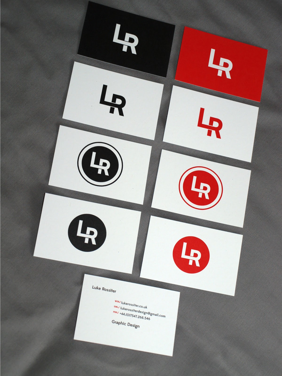

Business cards were a simple choice for me, I had them printed on heavy recycled card, which are uncoated and great to be drawn on. This means notes can be made before I hand them over. The logo I designed is a simple mash-up of my initials. I ended up printing 8 versions so I had a choice of cards and to also see which ones came out best.
Subscribe to:
Comments (Atom)