"We designed these two colour litho self promotional mailer/resumés for approaching Sydney based agencies at the end of 2008. The idea was to create a promotional piece which would have impact and showcase work examples and information as well as become a physical example of work in itself. The response to these was excellent and resulted in a variety of interviews at some of Sydney's top agencies."
Strengths: Bold Imagery, shows a range of work in a simple but effective way, not too large to need to throw away to save space, not too small to throw away because its worthless.
Weakness: Begining to look dated due to the number of people who have copies this idea.
Opportunities: Designed to express themselves as a creative team. Worked well and resulted in a number of opportunities.
Threats: Threat of the mailer looking dated by the time it has been copied to death and loosing relevance.
Espen Hansen:
"I believe that the key to optimize a marketing strategy is to use visual communication to reach the right target audience."
Strength: Bold focus on target audience. Throws out trendy design for hitting target.
Weakness: Not a modern looking design that other designers may find a bit out of date.
Opportunities:Clear that the branding is for tough sportswear, other likeminded clothes manufaturies may get in contact. Possibility that disregarding trends will lead to timeless design.
Threats: That this style will look ever-more dated in a few years time and the branding will need to be updated.
Passport:
As the name Passport suggests, travel is a large source of inspiration for us. Where you are born; where you grow up; where you study; where you work; where you visit affects everything from choice of colour to application of type – and we like that. Our branded stationery needed to reflect all of these interests. We wanted it to feel classic but contemporary, formal yet approachable, whilst taking care to present a close attention to detail that we pride our work on. The printed collateral includes personal photography collected from our travels to add a strong, individual element to the identity.
Strengths: Bold and up to date design style with a solid use of colour and attention to detail. Appreciation of simple design means that the aesthetic is unlikely to look bad in the future.
Weakness: Everyone is doing this sort of photography now. Branding only applied to small everyday items.
Opportunities: Strong personal visual identity reflects well on aspirations and for clients.
Threats: Being a small studio will require a lot of work to get noticed.
Two Times Elliott:
"A refresh of our corporate stationery, identity and website. The idea was to create an understated, simple and tactile set using a combination of GFSmith papers, foils and embossed details."
Strengths: Again a simple idea with bold design. Solid use of colour and concept.
Weaknesses: Probably not the aim but a lot of clients may not see the beauty in the style. Will probably look bad in a decade, so they will probably refresh their visual identity again.
Opportunities: Croporate stationary reflects well on the practice as a whole.
Threats: Again they will probably have to refresh their design styles again after a while.
Edenspiekermann:
"TCHO – that's highest quality fair trade chocolate manufactured using the most modern technology in a gigantic warehouse in the San Francisco docks. The challenge for Edenspiekermann is to give this gourmet's experience a face. The possibilities are endless, as TCHO is still in the starting blocks."
Strengths: Strong link to brand identity and a real sense that the clients needs were met. Expensive and finished well.
Weaknesses: Some of the patterns look like a kaleidoscope. Perhaps also the foiling is over the top in my opinion.
Opportunities: Interesting to see a cutting edge design studio take on something old and established like chocolate.
Threats: Applying this sort of design to an item with an established visual identity may backfire. I also thing that the whole thing could took a bit 70's what with all the browns and orange in a few years time.
Uniform:
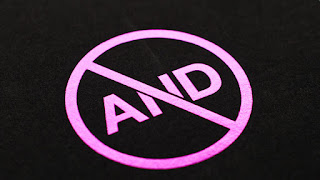
"Abandon Normal Devices (AND) is a major regional festival of new cinema and digital culture already in its second year and is driven by an exciting new partnership between three of the UK’s leading art and culture institutions. Cornerhouse in Manchester, FACT (Foundation for Art and Creative Technology) in Liverpool and Folly in Lancaster have joined forces to collaborate on the exciting task of creating a new festival from scratch."
Strengths: Use of visual puns and satire are a strong way to convey a message in an intelligent way.
Weaknesses:
Opportunities: Being part of a startup festival is probably a great experience, and provides the designers will an interesting creative challenge.
Threats: Looks like a protest logo.
OAT:
"With a "naughty child" and a face full of noodles, we knew we would have some fun helping this British-based restaurant group transition to the us market, by expanding their brand through illustration and design for onsite collateral, apparel and advertising."
Strengths: Plays to the consumer and market well. Strong use of application of design.
Weaknesses: Some illustrations and overcomplicated colour pallet are a weak choice in my opinion.
Opportunities: To help a British brand work internationally. Will bring fame and monies.
Threats: That the branding does not go far enough to capture the imagination.
Studio Output:
The BBC Concert Orchestra hosts an eclectic array of concerts and produces bespoke promotional material relevant to each event. 2012 saw two concerts exploring extreme emotional states, under the names 'Exstatica' and 'H7steria'. We created a unique look & feel to promote each event, reflecting both the themes addressed in the music and the emotions felt by the audience.
Strengths: High level of visual imagery and interesting use of bold colour and layout.
Weakness: None.
Opportunities: To be involved in an unusual form of music and contribute to a cultural experience.
Threats: None
Why Not Associates:
"Corporate identity for xtreme information’s media resource service showcasing commercials and promos."
Strengths: Simple identity will a great example of application that really shows off its diversity. Easily reproducible.
Weakness: None.
Opportunities: Level of refinement is beyond a lot of other identity examples here.
Threats: None.
Futurebrand:
We are proud to work with some of the largest, most dynamic and future-focused companies in the world to create future brands.
Strengths: Have experience in re branding airlines. Simple logo with patriotic imagery.
Weakness: Like the old logo could look out of data in a few decades time.
Opportunities: Expand reputation for good airlines re-brand.
Threats: See weaknesses.


No comments:
Post a Comment