http://www.designworklife.com/2012/03/27/mind-design-the-collection-identity/
This multicoloured foiling blew my mind.
http://erikssonjonas.com/category/talents/?cbg_tz=180
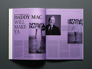
These spreads use the same multicoloured but monotone design aethetics as I have been using, however here the colour fills the whole page and the text is black.
http://www.reidjamie.co.uk/index.php?/projects/macaca-mulatta/
These DPS use an insane variety of colour that I would not have though of doing myself because I follow the rules too often, then again this does seem to be a fine artists work.
http://www.wakey.fr/?p=josephine4
This magazine uses some crazy layouts to that run over the centrefold of a DPS an interlocks with the grid on the other side.


No comments:
Post a Comment