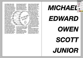
Based on some tutorials we have had in Indesign I have created some initial design layouts for the DPS. The grid system is 6 columns wide with standard default margins.
With this I filled some blocks of text with placeholder text, placeholder is just random words in the Latin language. I did this to see how the text would fit around an image of a bass drum. An interesting mechanic in Indesign that can form text around an image or shape. I have included Mickeys full name in this test to see of that could look good on a page.
I realise that this is terrible design, mostly this has been an experiment into how I could fit text and image on the page at a later date.


No comments:
Post a Comment