Monday, 28 May 2012

OUGD 402// Self Evaluation


BA (Hons.) GRAPHIC DESIGN
LEVEL
04
 Module Code 
OUGD402               


 Module Title
Personal Professional Practice


END OF MODULE SELF-EVALUATION

NAME

Luke Rossiter


1.  What skills have you developed through this module and how effectively do you think you have applied them?

I have mainly gained a greater appreciation of how large the field of graphic design is, and how many branches and sub branches it has. For example, there is branding and identity design, then logo design or business card design as braches of this. The world of graphic design as a whole has really opened itself up to me. I have also found dozens of new designers and websites that I can follow and gain inspiration from in a variety of fields from poster design to information and wayfinding. I have also learnt the basics for Indesign, a superb program that has opened up publishing to me, something I have never really done before but have based many major project on this year.


2. What approaches to/methods of design production have you developed and how have they informed your design development process?

Having learnt some new skills in InDesign I have be producing many, many more publications. I have also improved my skills in Indesign to level where I can help others when they are stuck, especially when it comes to sending the files to print correctly and adjusting large amounts of text.
With a greater knowledge of the different classifications of design I have been able to be more sure about what I want to produce, new areas of design that I had never considered before have become areas I have great interest in, for example alternative business card design.


3. What strengths can you identify in your work and how have/will you capitalise on these?

Once again I have gained strength in the technical aspect of design, I usually understand technology so I tend be fairly proficient with the new software I am introduced too. In the future I hope to move into a higher level of understanding in the three main design tools provided by Adobe, especially Photoshop with has un unbelievable learning curve.


4. What weaknesses can you identify in your work and how will you address these in the future?

A weakness I have is lack or urgency or speed. I am fairly good at getting tasks completed on time but I always seem to spend twice as long and provide the same amount and quality of work as me peers. This was something I discovered during some of the study tasks when we were asked to evaluate ourselves as designers. I have also developed a messed up balance between my social, work and domestic life, some weeks I work too hard, other weeks I spend far too long socialising. The good news is that next year I will have a house full of graphic designers, so they will keep the same schedule as me instead of how things are at the moment; where I am persuaded away from my work by my friends on less intense courses.


5. Identify five things that you will do differently next time and what do you expect to gain from doing these?

1)    Live with graphic designers so my social life can be the same structure as them. This way we can all work on projects at home as well as at college and dedicate similar time slots to social and domestic activities.
2)    Spend a greater amount of time caring for my PPP blog, it has been neglected compared to my context and practice blogs. I feel that this will not happen next year as I believe PPP takes up a bigger chunk of our time table.
3)    Work at posting more work than is expected or set, I always realise that the more work I do the better I will become at design. And the greater understanding I will have into the principles of design.
4)    I will try to do more personal work and post it to the blog, this ability to generate your own work is something that the most respected designers practise so is something I should do too.
5)    I would like to develop a more personal style. At the moment I tend to find inspiration from book and the Internet but I really don’t want to always conform to safe design styles. If I can do this I believe that I will earn more respect as a designer and have more confidence in my own creativity.


6.How would you grade yourself on the following areas:
(please indicate using an ‘x’) 

5= excellent, 4 = very good, 3 = good, 2 = average, 1 = poor

1
2
3
4
5
Attendance


x
Punctuality


x
Motivation


x

Commitment


x


Quantity of work produced


x


Quality of work produced


x


Contribution to the group


x

The evaluation of your work is an important part of the assessment criteria and represents a percentage of the overall grade. It is essential that you give yourself enough time to complete your written evaluation fully and with appropriate depth and level of self-reflection. If you have any questions relating to the self evaluation process speak to a member of staff as soon as possible.

Saturday, 26 May 2012

SPEAKING FROM EXPERIENCE// Publication Evaluation

 The following images are screen shots of the final publication in Indesign. The publication is still waiting to be printed, I will get this done before submission on the 28th.
Overall I think that the publication is a useful tool and guide for a new first year student. It lays out a good number of interesting and inspiring websites to visit that have the potential to improve the students contextual, practical and personal design development.
Visually the publication has a simple design and layout. I needed it this way so that it did not become bogged down with information or imagery that would make the aim unclear. At the same time I think that it is still a visually interesting piece of design because of the interesting use of type as a way-finder and the strong emphasis on the grid. Also the different colours allow the publication to look slightly more interesting, if it was all once colour I can imagine it would become quite dull to look at.
A large amount of research went into producing this work which is important to mention form a contextual viewpoint. The information that the reader can gain is solid and trustworthy which means a lot to the success of this publication.
Issues I have include the decision to make this a printed publication, many people suggested that this should be a website in its own right. I Did give this idea a lot of consideration but I felt that if this was to be published and handed out to students in reality they would be more receptive of the contents, rather than jotting down a web address and forgetting about it later, this publication is hard to loose and stands out amongst the reams of paper that you collect in the first few weeks.


Wednesday, 23 May 2012

SPEAKING FROM EXPERIENCE// Publication Progress 4

 This section details the development of the front cover to this publication.

 I wanted to create something that was based on my sketches earlier, with the open laptop and screen reading best friend, worst enemy. I sketched out this image with the pen tool.

 Here it is with the line point increased.

 With this image I created this crazy shape. Its based on how computers used to crash when they ran out of memory and caused windows to duplicate if you tried to move them about the screen. I changed the colour of this work to cyan so that black text can be visible on top.


 Here I have added the text I originally planned to have appear on the screen. Because of the size of the laptop screen and its relationship with the width of the a4 page I thought it would be better to place this above, in a much larger space.


 The way that Didot interacts with the thin lines of the image is not good here, the thin parts of the text are blotted out. The text will have to be updated to one which is bolder.

 I experimented with this bold Helvetica inspired font called airbus but it sits too heavy.

 In the end I settled for Bebas and Rockwell, two fonts that work nicely here. Also they are the typefaces that are used on the inside of the publication, they should have been my first choice. I also added this overlay, with exclusion effect applied. This means that the text stands out very vividly, unfortunately at the expense of the image.

 To counter this effect I made the final laptop in the sequence more noticeable by changing the stroke to 3p and filling it in white.

 I just tested some other colours to see if they would be suitable.

 Finally I settled on this black outlines image and included a blue background to reduce the contrast with the old white background and the image. I also had to format the design to A4 size because for some reason I was working in a tabloid size before.

Sunday, 20 May 2012

SPEAKING FROM EXPERIENCE// Publication Progress 3

 Now that the main body of the publication has been finished I can turn my head to the contents pages. I aimed at having one descriptive page, introducing the reader to the publication and another that serves as a table of contents.

The contents page is very simple, instead of using page numbers I used colour. I feel that this is not a problem because this is such a short publication. The colours here associate with the page colour themes.  

This is a screen of the welcome page. It basically just outlines how the publication works with an identical layout to an individual segment of the website lists.


The publication is not 12 pages long, I just have to sort a cover page, and send this to print.

Saturday, 19 May 2012

SPEAKING FROM EXPERIENCE// Publication Progress 2

 Since I have already collected all of the content and prepared it for the publication I assumed the construction of it would be fairly easy...

 My first task was to write all of the website titles in the steps on 45 degree line format. This was fairly easy by time consuming with all of the referencing double checking. I worked this out in illustrator, created outlines and them exported to Indesign.

 Once in indesign the website titles could be coloured and sized appropriately. Here you can see the dimensions I gave to each component; two columns for the image, one for the title and three for the descriptive text. Here, as in the rest of the publication, the website screen has had to be cut up at the edges to keep to strict confinements that will run throughout.

The first dps that I finished (with placeholder text) was the Pinterest page. Here I can see how strongly the Riso stuff impacted on this design style. The green colour has been a match to the green they used, perhaps because it is a solid mix of cyan and yellow. I like the interaction between the image and the body copy, especially how the title seems to link the two together like an arrow to the start of the descriptive text.

After all of the designs had been finished and filled with placeholder text I went about importing the descriptions in from this blog. I wrote them a while back based on information I could gather from the websites own 'about' section as well as my own personal experience of the site. I also added the site URL to the top of the description in Rockwell Bold Italic. The aim was to separate the URL from the text while also retaining the connection.
After a few more pages has been completed I decided to shorten the URL to its minimum size. This massively increases the user friendliness of the URL as well as clearing up clutter in the page with all those glyphs.

Friday, 18 May 2012

SPEAKING FROM EXPERIENCE// Publication progress 1

 This is just a short post about how I prepared my images for the publication.

 First off I took a screenshot of the website in question, here it is Jeff Andrews pinterest page. I scaled the edges so only the page itself was showing.

I then used a layer mask to turn the image into a black and white image while keeping the colour profile in cmyk. In some case I used the desaturate tool instead (shift, ctrl, U).

I then used another layer mask to add colour back to the image, Each page will have its own theme and for the pinterest page that theme will be green. I created the green out of cyan and yellow to avoid any print issues with colour matching later (instead of using the RGB slider).

By just changing the midtone to green I got a nice soft green tint to the image. This will be added to the publication later.

I will have to repeat this process for all 40 website that will be included in the publication. 

Thursday, 17 May 2012

SPEAKING FROM EXPERIENCE// Riso Party Inspiration

Earlier I went to the Leeds Catch Up Riso Party run by Jay Cover (Nous Vous), Tom Pratt and Oliver Shaw (Catalogue) and Sophie Thornberry. Two of them being ex students I was a very intersting night to chat and learn from these people. 
I also picked up some free publications from them for some inspiration into my own. Check these out:
 This magazine was created using a Riso printer, it leaves a kind of grainy, dusty finish to the ink. It is very unique to me but the printed product can run off in your hands even after it has dried it would appear. Interestingly this page, which acts as the cover doesn't seem to have a clear grid like the other two.

 Opposed to the cover the next two pages have a strong grid system. I am also interested in the way that colour is reproduced by the Riso printer, I would like to know if the three colours are made up from a mixture of CMYK over two prints or are printed directly from a single drum.


 This is a poster by Nous Vous about interest in collaborative projects. It is interesting to see them use a mixture of illustration and type in such a formulaic way.

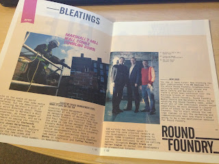
 There was also this full colour publication called Bleat that is about creative spaces.

 Its design follows these coloured markers (top left) for each chapter with large heavy titles and much smaller body copy text.


SPEAKING FROM EXPERIENCE// Design Layout

Earlier in college I drew up a preliminary design layout, based on some earlier sketches and with some of the styling of the Riso party stuff it is fairly simple but I think it will convey the information clearly and without any filler or unnecessary waffle. 

 The publication can follow a strict grid layout with the title taking up a large space as a traditional header. The name of the website or person, depending on the subject is drawn up an ascending line, each letter making another step. This links the image to the text like an arrow, It also allows long titles to fit in a tighter space and looks visually interesting.  The page header is in bebas while the site titles are in Franchise bold. They body copy is in Rockwell and is just placeholder text here for effect.
 

Tuesday, 15 May 2012

SPEAKING FROM EXPERIENCE// Inspiration

 http://www.designworklife.com/2012/03/27/mind-design-the-collection-identity/
 This multicoloured foiling blew my mind.

 http://erikssonjonas.com/category/talents/?cbg_tz=180
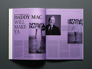
 These spreads use the same multicoloured but monotone design aethetics as I have been using, however here the colour fills the whole page and the text is black.

 http://www.reidjamie.co.uk/index.php?/projects/macaca-mulatta/
 These DPS use an insane variety of colour that I would not have though of doing myself because I follow the rules too often, then again this does seem to be a fine artists work.

 http://www.wakey.fr/?p=josephine4
This magazine uses some crazy layouts to that run over the centrefold of a DPS an interlocks with the grid on the other side.